

반응형
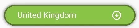
DecoratedBox(
  decoration: BoxDecoration(
     color:Colors.lightGreen, //background color of dropdown button
     border: Border.all(color: Colors.black38, width:3), //border of dropdown button
     borderRadius: BorderRadius.circular(50), //border raiuds of dropdown button
     boxShadow: <BoxShadow>[ //apply shadow on Dropdown button
            BoxShadow(
                color: Color.fromRGBO(0, 0, 0, 0.57), //shadow for button
                blurRadius: 5) //blur radius of shadow
          ]
  ),

  child:Padding(
    padding: EdgeInsets.only(left:30, right:30),
     child:DropdownButton(
      value: "United Kingdom",
      items: [ //add items in the dropdown
        DropdownMenuItem(
          child: Text("United Kingdom"),
          value: "United Kingdom",
        ),
        DropdownMenuItem(
          child: Text("Canada"),
          value: "Canada"
        ),
        DropdownMenuItem(
          child: Text("Russia"),
          value: "Russia",
        )

      ],
      onChanged: (value){ //get value when changed
          print("You have selected $value");
      },
      icon: Padding( //Icon at tail, arrow bottom is default icon
        padding: EdgeInsets.only(left:20),
        child:Icon(Icons.arrow_circle_down_sharp)
      ),
      iconEnabledColor: Colors.white, //Icon color
      style: TextStyle(  //te
         color: Colors.white, //Font color
         fontSize: 20 //font size on dropdown button
      ),

      dropdownColor: Colors.redAccent, //dropdown background color
      underline: Container(), //remove underline
      isExpanded: true, //make true to make width 100%
     )
  )
)
DecoratedBox(
    decoration: BoxDecoration(
          gradient: LinearGradient(
            colors: [
              Colors.redAccent,
              Colors.blueAccent,
              Colors.purpleAccent
              //add more colors
            ]),
          borderRadius: BorderRadius.circular(5),
          boxShadow: <BoxShadow>[
            BoxShadow(
                color: Color.fromRGBO(0, 0, 0, 0.57), //shadow for button
                blurRadius: 5) //blur radius of shadow
          ]
    ),
    child: Padding(
      padding: EdgeInsets.only(left:30, right:30),
      child:DropdownButton(
          value: "menuone",
          items: [
              DropdownMenuItem(
                child: Text("Menu One"),
                value: "menuone",
              )
          ],
          onChanged: (value){

          },
          isExpanded: true, //make true to take width of parent widget
          underline: Container(), //empty line
          style: TextStyle(fontSize: 18, color: Colors.white),
          dropdownColor: Colors.green,
          iconEnabledColor: Colors.white, //Icon color
        )
    )
)

https://www.fluttercampus.com/guide/211/style-dropdown-button-flutter/
How to Style DropdownButton in Flutter
In this example, we are going to show how to style DropdownButton, such as applying background color, border width, border color, border-radius, box-shadow, Dropdown Menu color, font color, font size, icons
www.fluttercampus.com
반응형
'[====== Development ======] > Flutter' 카테고리의 다른 글
| Dart 버전 업그레이드 및 Pub 버전 업그레이드 후 Firebase 관련 문제로 빌드 오류 발생시 대응 방법 (2) | 2024.02.11 |
|---|---|
| Flutter - WebViewController 스크롤 이동 (1) | 2023.12.18 |
| Flutter - Double Siver AppBar (0) | 2023.12.17 |
| Flutter release 로 실행하는 방법 (0) | 2023.12.17 |
| Flutter - GetX Navigation 사용법 (0) | 2023.12.13 |