

반응형
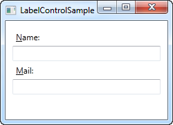
Label
- 일반적으로 control에 대한 설명을 제공하는데 사용함 (Text)
TextBlock
- 문자를 포함하는 Control의 가장 작은 단위 Content로 사용되며, 작은양의 유동 Contents를 표시gka.
-
Textblock의 주요 속성 (더 자세한 내용- Textblock properties)
Foreground 글씨에 적용되는 색상을 설정하는 Property
FontWeight 글씨의 두께를 설정하는 Property FontSize 글씨의 크기를 설정하는 Property FontFamily 글씨체를 설정하는 Property FontStyle 글씨 스타일을 설정하는 Property
Value: Normal / Italic / ObiliqueText 텍스트 컨텐츠를 가져오거나 설정하는 Property TextAlingnment 텍스트의 가로맞춤을 설정하는 Property
Value: Center/ Justify / Left / RightTextTrimming 컨텐츠가 영역을 넘어가게 될경우 적용할 Text를 잘라내는 동작을 설정하는 Property
Value: None/ CharacterEllipsis / WordEllipsisTextWraping Text의 줄바꿈 형식을 설정하는 Property
Value: NoWrap / Wrap / WrapWithOverflow
TextBox
- 일반적인 입력 필드 Control

-
TextBox Style Template 구조
- Border
└ ScrollViewer - Placeholder Label
- Border
<ControlTemplate TargetType="{x:Type TextBox}">
    <Grid>
        <Border x:Name="Bd" BorderBrush="{DynamicResource colorTxbLine_N}" BorderThickness="1" Background="{DynamicResource colorTxb_N}" SnapsToDevicePixels="true">
            <ScrollViewer x:Name="PART_ContentHost" VerticalAlignment="Center" SnapsToDevicePixels="{TemplateBinding SnapsToDevicePixels}" HorizontalScrollBarVisibility="Hidden" VerticalScrollBarVisibility="Hidden"/>
        </Border>
        <Label x:Name="InternalWatermarkLabel" Margin="{TemplateBinding Padding}" Content="{TemplateBinding Tag}" Visibility="Collapsed" Focusable="False" VerticalAlignment="Center" Foreground="{TemplateBinding Foreground}" Opacity="0.7"/>
    </Grid>
<ControlTemplate/>- TextBox 주요 속성 (더 자세한 내용- Textbox properties)
| CaretBrush |
커서의 색상을 설정하는 Property |
| MaxLength | 입력란에 넣을수 있는 최대문자 수를 설정하는 Property |
| Multiline | 입력란에 여러줄을 입력할 수 있는 Control로 적용할지 여부를 설정하는 Property |
| Padding | 입력란 내부에 여백을 설정하는 Property |
| IsReadOnly | 수정이 불가하도록 설정하는 Property |
PasswordBox
- 비밀번호를 입력하는 Control
- 해당 입력란에 문자를 입력하면 암호화하여 표시됨

-
PasswordBox 주요 속성 (더 자세한 내용- Passwordbox properties)
PasswordChar 암호를 어떤 문자로 표시할지 설정하는 Property
ComboBox
- 사용자가 목록에서 항목을 선택하거나 새 값을 입력할수 있도록 하는 Control

- ComboBox Template 구조
-
Grid
├ ToggleButton
├ Placeholder label
├ Contents Presenter
└ Pop up
└Border
└ScrolViewer
└ Grid
└ Canvas
└ Rectangle
└ ItemPresenter (Listbox속성 - ItemContainerStyle의 설정값을 가져옴)
-
<ControlTemplate TargetType="{x:Type ComboBox}">
    <Grid x:Name="MainGrid" SnapsToDevicePixels="true">
        <Grid.ColumnDefinitions>
            <ColumnDefinition Width="*"/>
            <ColumnDefinition MinWidth="{DynamicResource {x:Static SystemParameters.VerticalScrollBarWidthKey}}" Width="0"/>
        </Grid.ColumnDefinitions>
        <Popup x:Name="PART_Popup" AllowsTransparency="true" Grid.ColumnSpan="2" IsOpen="{Binding IsDropDownOpen, RelativeSource={RelativeSource TemplatedParent}}" PopupAnimation="{DynamicResource {x:Static SystemParameters.ComboBoxPopupAnimationKey}}" Placement="Bottom">
            <Microsoft_Windows_Themes1:SystemDropShadowChrome x:Name="Shdw" Color="Transparent" MaxHeight="{TemplateBinding MaxDropDownHeight}" MinWidth="{Binding ActualWidth, ElementName=MainGrid}">
                <Border x:Name="DropDownBorder" BorderBrush="{DynamicResource colorBgListLine}" BorderThickness="1" Background="{DynamicResource colorBgList}" Margin="0,2" >
                    <ScrollViewer x:Name="DropDownScrollViewer">
                        <Grid RenderOptions.ClearTypeHint="Enabled">
                            <Canvas HorizontalAlignment="Left" Height="0" VerticalAlignment="Top" Width="0">
                                <Rectangle x:Name="OpaqueRect" Fill="{Binding Background, ElementName=DropDownBorder}" Height="{Binding ActualHeight, ElementName=DropDownBorder}" Width="{Binding ActualWidth, ElementName=DropDownBorder}"/>
                            </Canvas>
                            <ItemsPresenter x:Name="ItemsPresenter" KeyboardNavigation.DirectionalNavigation="Contained" SnapsToDevicePixels="{TemplateBinding SnapsToDevicePixels}"/>
                        </Grid>
                    </ScrollViewer>
                </Border>
            </Microsoft_Windows_Themes1:SystemDropShadowChrome>
        </Popup>
        <ToggleButton x:Name="btn" Grid.ColumnSpan="2" IsChecked="{Binding IsDropDownOpen, Mode=TwoWay, RelativeSource={RelativeSource TemplatedParent}}" Style="{StaticResource tgb_cmbGeneral}"/>
        <Label x:Name="InternalWatermarkLabel" Margin="12,0" Content="{TemplateBinding Tag}" Visibility="Collapsed" Focusable="False" Foreground="{DynamicResource colorLblBtn}" Opacity="0.7" VerticalAlignment="Center"/>
        <ContentPresenter Margin="18,0" ContentTemplate="{TemplateBinding SelectionBoxItemTemplate}" ContentTemplateSelector="{TemplateBinding ItemTemplateSelector}" Content="{TemplateBinding SelectionBoxItem}" ContentStringFormat="{TemplateBinding SelectionBoxItemStringFormat}" HorizontalAlignment="Left" IsHitTestVisible="false" SnapsToDevicePixels="{TemplateBinding SnapsToDevicePixels}" VerticalAlignment="Center"/>
</Grid>- Combobox 주요 속성 (더 자세한 내용- Combobox properties)
| ItemContainerStyle | 각 항목에 대해 생성된 컨테이너 요소에 적용된 Stlye을 가져오거나 설정하는 Property |
| HasItems | ItemControl에 항목이 있는지 여부를 나타내는 Property |
반응형
'[====== Development ======] > C#' 카테고리의 다른 글
| WPF(XAML) - ETC Class (0) | 2021.01.21 |
|---|---|
| WPF(XAML) - Data Class (0) | 2021.01.21 |
| WPF(XAML) - Button Class (0) | 2021.01.15 |
| WPF(XAML) - Shape Class (0) | 2021.01.15 |
| WPF(XAML) - Layout Class (0) | 2021.01.15 |