

반응형
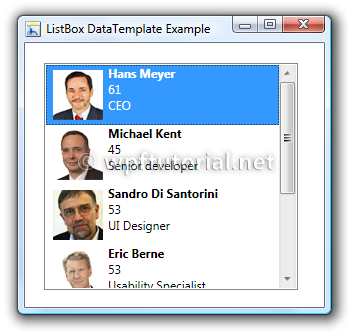
ListBox
- 선택 가능한항목의 리스트 Control
-
ListBox Style Template 구조
- Border
└ ScrollViewer
└ ItemsPresenter (ListBoxItem의 설정값을 가져옴)
- Border
-
ListBoxItem주요 속성 (더 자세한 내용- ListboxItem properties)
IsSelected 해당항목의 선택여부를 설정하는 Property
ListView
- 데이터 항목 목록을 표시하는 Control
- Header가 있다. (ListBox와 차이점)

-
ListView Style Template 구조
- Border
└ ScrollViewer
└ ItemsPresenter (ListViewItem의 설정값을 가져옴) - GridViewColumnHeader (Header 스타일)
└ ContentsPresenter
└ Thumb
- Border
-
ListViewItem주요 속성 (더 자세한 내용- ListboxItem properties)
IsSelected 해당항목의 선택여부를 설정하는 Property
Datagrid
(참고: https://blogs.msdn.microsoft.com/jaimer/2009/01/20/styling-microsofts-wpf-datagrid/ )
- DataGrid 기본구성

-
Style Structure
- DataGrid
└ DataGridColumnHeaderPresenter
└ Thumb (GripperStyle)
└ DataGridColumnHeader
└ DataGridRow
└ DataGridCellsPresenter
└ DataGridCell
└ DataGridDetailsPresenter
- DataGrid
-
Style Template
DataGrid ControlTemplate
<ScrollViewer x:Name="DG_ScrollViewer" Focusable="false" >
    <ScrollViewer.Template>
        <ControlTemplate TargetType="{x:Type ScrollViewer}">
            <Grid>
                <Grid.ColumnDefinitions>
                    <ColumnDefinition Width="*"/>
                    <ColumnDefinition Width="auto"/>
                </Grid.ColumnDefinitions>
                <Grid.RowDefinitions>
                    <RowDefinition Height="auto"/>
                    <RowDefinition Height="*"/>
                    <RowDefinition Height="auto"/>
                </Grid.RowDefinitions>
                <DataGridColumnHeadersPresenter Style="{DynamicResource dtgHeaderPresenter}" Visibility="{Binding HeadersVisibility, ConverterParameter={x:Static DataGridHeadersVisibility.Column}, Converter={x:Static DataGrid.HeadersVisibilityConverter}, RelativeSource={RelativeSource AncestorType={x:Type DataGrid}}}" SnapsToDevicePixels="False"/>
                <ScrollContentPresenter x:Name="PART_ScrollContentPresenter" Grid.Row="1" Grid.ColumnSpan="2" CanContentScroll="{TemplateBinding CanContentScroll}"  />
                <Grid Grid.Column="1" Grid.Row="1" >
                    <Grid.RowDefinitions>
                        <RowDefinition Height="{Binding NonFrozenColumnsViewportHorizontalOffset, RelativeSource={RelativeSource AncestorType={x:Type DataGrid}}}"/>
                        <RowDefinition Height="*"/>
                    </Grid.RowDefinitions>
                    <ScrollBar  x:Name="PART_VerticalScrollBar" Maximum="{TemplateBinding ScrollableHeight}" Margin="0,2" Orientation="Vertical" Grid.Row="1" Visibility="{TemplateBinding ComputedVerticalScrollBarVisibility}" Value="{Binding VerticalOffset, Mode=OneWay, RelativeSource={RelativeSource TemplatedParent}}" ViewportSize="{TemplateBinding ViewportHeight}"/>
                </Grid>
                <Grid Grid.Column="0" Grid.ColumnSpan="2"  Grid.Row="2">
                    <Grid.ColumnDefinitions>
                        <ColumnDefinition Width="{Binding NonFrozenColumnsViewportHorizontalOffset, RelativeSource={RelativeSource AncestorType={x:Type DataGrid}}}"/>
                        <ColumnDefinition Width="*"/>
                    </Grid.ColumnDefinitions>
                    <ScrollBar x:Name="PART_HorizontalScrollBar" Grid.Column="1" Margin="0,4" Maximum="{TemplateBinding ScrollableWidth}" Orientation="Horizontal" Visibility="{TemplateBinding ComputedHorizontalScrollBarVisibility}" Value="{Binding HorizontalOffset, Mode=OneWay, RelativeSource={RelativeSource TemplatedParent}}" ViewportSize="{TemplateBinding ViewportWidth}"/>
                </Grid>
            </Grid>
        </ControlTemplate>
    </ScrollViewer.Template>
    <ItemsPresenter/>
</ScrollViewer>
DataGridColumnHeaderPresenter Template
<Setter Property="Template">
    <Setter.Value>
        <ControlTemplate TargetType="{x:Type DataGridColumnHeadersPresenter}">
            <Grid>
                <DataGridColumnHeader Style="{DynamicResource dtgGeneralHeader}"/>
                <ItemsPresenter/>
            </Grid>
        </ControlTemplate>
    </Setter.Value>
</Setter>
Thumb (GripperStyle)
<ControlTemplate TargetType="{x:Type Thumb}">
    <Border/>
</ControlTemplate>
DataGridColumnHeader
<Style TargetType="{x:Type DataGridColumnHeader}">
        <Setter Property="Background" Value="{DynamicResource BrushTransparent}"/>
        <Setter Property="Foreground" Value="{DynamicResource BrushBlack}"/>
        <Setter Property="HorizontalAlignment" Value="Stretch"/>
        <Setter Property="VerticalAlignment" Value="Stretch"/>
        <Setter Property="VerticalContentAlignment" Value="Center"/>
        <Setter Property="HorizontalContentAlignment" Value="Center"/>
        <Setter Property="Height" Value="46"/>
        <Setter Property="SeparatorBrush" Value="{DynamicResource BrushLineGeneralBorder}" />
        <Setter Property="FontSize" Value="14"/>
        <Setter Property="FontWeight" Value="Bold"/>
        <Setter Property="Template">
            <Setter.Value>
                <ControlTemplate TargetType="{x:Type DataGridColumnHeader}">
                    <Grid x:Name="grdDatagridHeader" Background='Transparent' HorizontalAlignment="Stretch" MinWidth="64">
                        <Grid.ColumnDefinitions>
                            <ColumnDefinition Width='Auto' />
                            <ColumnDefinition Width='*' MinWidth="54"/>
                            <ColumnDefinition Width='Auto' />
                        </Grid.ColumnDefinitions>
                        <Grid.RowDefinitions>
                            <RowDefinition Height='8'/>
                            <RowDefinition />
                        </Grid.RowDefinitions>
                        <Rectangle x:Name="BackgroundRectangle" Grid.ColumnSpan="3" Grid.RowSpan="2" Fill="{TemplateBinding Background}" Stretch="Fill" />
                        <ContentPresenter SnapsToDevicePixels="{TemplateBinding SnapsToDevicePixels}"  VerticalAlignment="Center" HorizontalAlignment="Center" Grid.ColumnSpan="3" Grid.Row="1" Margin="4,0,8,0"/>
                        <Path x:Name="SortArrow" VerticalAlignment="Center" HorizontalAlignment="Center" Width="8" Height="4" Opacity="0" RenderTransformOrigin=".5,.5" Grid.ColumnSpan="3" Grid.Row="0" Fill="{DynamicResource BrushIconArrow}" Stretch="Uniform" Data="{DynamicResource resIconAscend}"/>
                        <Thumb x:Name="PART_LeftHeaderGripper" Grid.Column="0" Grid.RowSpan="2" HorizontalAlignment="Left" Style="{StaticResource ColumnHeaderGripperStyle}"/>
                        <Thumb x:Name="PART_RightHeaderGripper" Grid.Column="2" Grid.RowSpan="2" HorizontalAlignment="Right" Style="{StaticResource ColumnHeaderGripperStyle}"/>
                        <Rectangle Width="1" Height="16" Fill="{DynamicResource BrushLineGeneralBorder}" Grid.Column="2" Grid.Row="1" HorizontalAlignment="Center" VerticalAlignment="Center" />
                    </Grid>
                    <ControlTemplate.Triggers>
                        <Trigger Property="SortDirection" Value="Ascending">
                            <Setter TargetName="SortArrow" Property="Opacity" Value="1" />
                            <Setter TargetName="SortArrow" Property="RenderTransform">
                                <Setter.Value>
                                    <RotateTransform Angle="180" />
                                </Setter.Value>
                            </Setter>
                        </Trigger>
                        <Trigger Property="SortDirection" Value="Descending">
                            <Setter TargetName="SortArrow" Property="Opacity" Value="1" />
                            <Setter TargetName="BackgroundRectangle" Property="Opacity" Value="1" />
                        </Trigger>
                    </ControlTemplate.Triggers>
                </ControlTemplate>
            </Setter.Value>
        </Setter>
        <Style.Triggers>
            <Trigger Property="IsPressed" Value="true">
                <Setter Property="Foreground" Value="{DynamicResource BrushIconArrow}"/>
            </Trigger>
            <Trigger Property="SortDirection" Value="Ascending">
                <Setter Property="Foreground" Value="{DynamicResource BrushIconArrow}"/>
            </Trigger>
            <Trigger Property="SortDirection" Value="Descending">
                <Setter Property="Foreground" Value="{DynamicResource BrushIconArrow}"/>
            </Trigger>
            <Trigger Property="IsEnabled" Value="false">
                <Setter Property="Opacity" Value="0.2"/>
            </Trigger>
        </Style.Triggers>
    </Style>
DataGridRow
<ControlTemplate TargetType="{x:Type DataGridRow}">
    <Border x:Name="DGR_Border">
        <SelectiveScrollingGrid>
            <SelectiveScrollingGrid.ColumnDefinitions>
                <ColumnDefinition Width="Auto"/>
                <ColumnDefinition Width="*"/>
            </SelectiveScrollingGrid.ColumnDefinitions>
            <SelectiveScrollingGrid.RowDefinitions>
                <RowDefinition Height="*"/>
                <RowDefinition Height="Auto"/>
            </SelectiveScrollingGrid.RowDefinitions>
            <DataGridCellsPresenter Grid.Column="1"  ItemsPanel="{TemplateBinding ItemsPanel}" Style="CellsPresenterStyle" />
            <DataGridDetailsPresenter Grid.Column="1" Grid.Row="1"  SelectiveScrollingGrid.SelectiveScrollingOrientation="{Binding AreRowDetailsFrozen,ConverterParameter={x:Static SelectiveScrollingOrientation.Vertical}, Converter={x:Static DataGrid.RowDetailsScrollingConverter}, RelativeSource={RelativeSource AncestorType={x:Type DataGrid}}}" Visibility="{TemplateBinding DetailsVisibility}"/>
        </SelectiveScrollingGrid>
    </Border>
</ControlTemplate>
DataGridCellsPresenter
<ControlTemplate TargetType="{x:Type DataGridCellsPresenter}">
    <Grid>
        <DataGridCell IsHitTestVisible="False" Style="{DynamicResource dtgGeneralCell}"/>
        <ItemsPresenter/>
    </Grid>
</ControlTemplate>
DataGridCell
<ControlTemplate TargetType="{x:Type DataGridCell}">
    <Grid  Background='Transparent'>
        <ContentPresenter />
    </Grid>
</ControlTemplate>
반응형
'[====== Development ======] > C#' 카테고리의 다른 글
| WPF(XAML) - Triggers (0) | 2021.01.21 |
|---|---|
| WPF(XAML) - ETC Class (0) | 2021.01.21 |
| WPF(XAML) - Text Class (0) | 2021.01.15 |
| WPF(XAML) - Button Class (0) | 2021.01.15 |
| WPF(XAML) - Shape Class (0) | 2021.01.15 |